In the world of data analysis and reporting, Power BI is the must-have tool to transform your data into actionable insights. Whether you're an experienced data analyst or just starting out with Power BI, there are always new ways to streamline your workflow and take your reports to the next level.
At our Power BI Academy, we’re constantly looking for ways to make working with Power BI easier, faster, and more effective. That’s why we’re sharing a few smart hacks and practical tips in this blog to help you speed up your workflow and ensure consistency across your reports.
These hacks are designed to tackle common Power BI challenges, like improving formatting, working more efficiently with visuals, and creating dynamic reports. We also cover how to integrate AI tools like ChatGPT to boost your Power BI skills and work more efficiently.
Curious how you can save time and make your reports more visually appealing? Keep reading and discover the best Power BI hacks for you!
1. A Clear and Purposeful Dashboard
An effective dashboard is all about clarity and focus. By focusing on what really matters, you make sure users can easily access insights without being overwhelmed. Here are a few practical tips for creating a clean, focused dashboard:
- Define the purpose and its audience
Think about what you want to achieve with the dashboard and who will use it. Is it for strategic decisions or operational support? Make sure the information and visuals meet your users’ needs.
- Put key KPIs at the top
Start with the most valuable KPIs. These figures deserve a prominent spot at the top of your dashboard so they stand out immediately.
- Limit the number of visuals
Keep it simple by using a maximum of three related visuals. Use them to show trends, comparisons, or distributions that support your KPIs. This prevents information overload.
- Use drill-throughs for details
Want to give users access to more data? Create a drill-through page. That way, your main dashboard stays clean, but users can still dive deeper when needed.
By keeping your dashboard simple and to the point, you improve usability and give users the insights they need without drowning them in data.
2. Measures Table and Folders for Measures
Good organization is essential. Not just for your dashboard, but also for your measures. Create a separate “Measures” table to keep everything neat and accessible.
Simply use the Enter Data option in Power BI to create an empty table. Once added, insert your first measure and delete the default column.
You now have a clean Measures table for organizing all calculations, which makes your data model easier to manage and collaborate on.
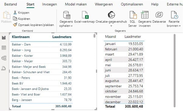
3. Grouping and Aligning Selections
Want a professional-looking dashboard with perfectly aligned visuals? In Power BI, you can align multiple visuals easily—but only if you group them first. Simply selecting them isn’t enough.
By grouping visuals, you can position and align them as a unit, giving your dashboard a clean, uniform appearance. This avoids lopsided visuals and boosts your dashboard’s professional look.
4. Tips for Using AI/ChatGPT in Power BI
AI tools like ChatGPT can be used to enhance Power BI skills and improve workflows. Here are a few ways AI can help you build better dashboards faster:
- Understand Power BI features
ChatGPT can walk you through things like:
"How do I create a relationship between two tables in Power BI?"
"What are DAX formulas and how do I use them?"
- Help with DAX and Power Query
Ask for assistance with writing DAX or transforming data:
"Can you give an example of a DAX formula to calculate total sales?"
"How do I use Power Query to split a column?"
- Advice on Visuals and Formatting
Not sure which chart to use? ChatGPT can suggest:
"What’s the best visual for showing trends over time?"
"How can I make my reports more visually appealing?"
- Troubleshooting
Running into issues? Ask things like:
"Why am I getting the error 'Unexpected value in column X'?"
"Why is my chart not displaying correctly?"
- Strengthen Data Analysis Knowledge
ChatGPT can clarify core concepts like normalization, aggregation, and statistical methods.
- Power BI Best Practices
Ask for tips like:
"What are best practices for Power BI report design?"
"How do I make sure my reports load quickly?"
- Write Advanced Queries
Get help writing M-code for Power Query or complex DAX queries.
By using AI effectively, you can level up your Power BI skills and report-building efficiency.
5. Format Painter Button
The Format Painter (copy/paste formatting) button is a familiar tool from Excel, and it’s just as useful in Power BI. It lets you easily apply the formatting of one visual to another, saving time and ensuring visual consistency.
6. Power BI layout File
Planning to create multiple reports but want a polished layout without wasting time? Create a Power BI layout template focused on formatting. Spend time designing it once and reuse it for future reports.
7. Use Recent color
Sounds familiar? You return to a report after a few days and want to match a color, but can’t remember the hex code.
Avoid wasting time by clicking on an existing visual, opening and closing the color settings, and voilà—the color appears under recent colors!
8. Custom tooltip
Custom tooltips allow you to add more context and detail to your visuals.
Here’s how to set one up:
-
Create a new page in your report.
-
Set the page type to Tooltip under page settings.
-
Add the visuals or text you want to show as a tooltip.
-
Link the tooltip to your visual in the visual settings.
This lets you provide more detailed information without cluttering your main dashboard.
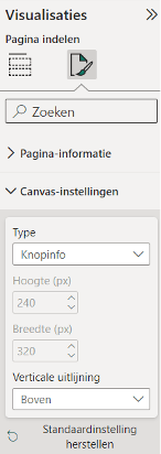
Custom tooltip page set as button info
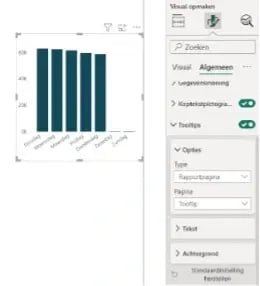
Setting up the tooltip
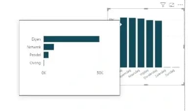
Possible result
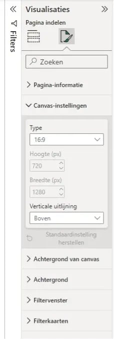
9. Canvas settings
By default, the canvas size in Power BI is set to 16:9. Sometimes, that’s too small, especially for published reports.
You can easily adjust the canvas size under Canvas Settings. It’s best to do this early in your process, as visuals won’t automatically resize if you change it later.
10. Widening columns
There are two ways to widen a column:
-
Drag manually: Set a custom width.
-
Double-click: Automatically resizes the column based on its contents.
11. Field parameter
Make your visuals more dynamic by allowing users to switch axes using a field parameter. After adding it, you can further customize your visual—or even add a button slicer for extra formatting options.
12. Uniform Visual Sizes
To make visuals the same size:
-
Select the visual with the correct dimensions.
-
Then select the others.
-
In the properties pane, adjust both height and width by one pixel, then return them to their original size.
Now, all visuals are the same size. Check out the video for a demo!
13. Versterk je KPI's met professionele iconen uit Power Point in Power BI
Want to add an icon or image to reinforce a KPI but don’t have any on hand? PowerPoint is your friend!
Here’s how:
-
Open PowerPoint and go to the Insert tab.
-
Click Icons and search for what you need.
-
Customize the icon:
-
Fill it with your desired color.
-
Resize it as needed.
-
-
Export it as PNG (for transparency) via Save as Picture.
-
Import the icon into Power BI using Insert.
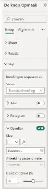
14. GIF in Power BI
Want to add a moving GIF to your Power BI dashboard? Unfortunately, this doesn't work via the Add Image option because the GIF won't move. Fortunately, there is a simple workaround: use an empty button!
Here's how to add a moving GIF using an empty button:
- Add a Button: Go to the Insert tab and choose a Button.
- Empty the button: Remove default text, icons or background from the button settings.
- Add the GIF: In the button settings, go to Style.
Under the Fill section, you can select an image. Choose your GIF file here. - Adjust the size: Make sure the button is just the right size to display your GIF properly.
With these powerful Power BI hacks, you can significantly speed up your work and ensure that your reports are not only effective, but also visually appealing and user-friendly. Improving your Power BI skills is an ongoing process, and by applying small tweaks and new techniques, you'll find that you can work much more efficiently and generate better insights. Which hack will you try first?
And don't forget to share this blog with colleagues or friends who also want to improve their Power BI skills! Together, we'll make data analysis and reporting easier, faster and more professional.
Want to learn more about Power BI and the opportunities it offers for your organization? Sign up for our Power BI Academy and get access to in-depth training, personal guidance, and valuable knowledge that you can immediately apply to your daily work.
Do you have questions or want to know more? Feel free to contact us at: academy@bricklog.nl.
Deel dit bericht

Who will make the reports if the Power BI specialist decides to leave?

Working with data requires trust

Nog geen reacties
Laat ons weten wat je denkt